Website Design
A website is not a brochure, or a poster, or a book. Unlike traditional print design, a website has to interact with its audience and respond to its environment. It’s fluid and active.
That’s why older, traditional design processes often fall short when applied to the web.
At Quinn Interactive, we take a comprehensive, agile approach to designing websites. And like good architects, we know you can’t design something well if you don’t also know how to build it well.
With 25 years of experience designing and building complex websites, we know how to design things that work as great as they look. Check out some examples in our portfolio.
Web Design Samples


Design Process Highlights
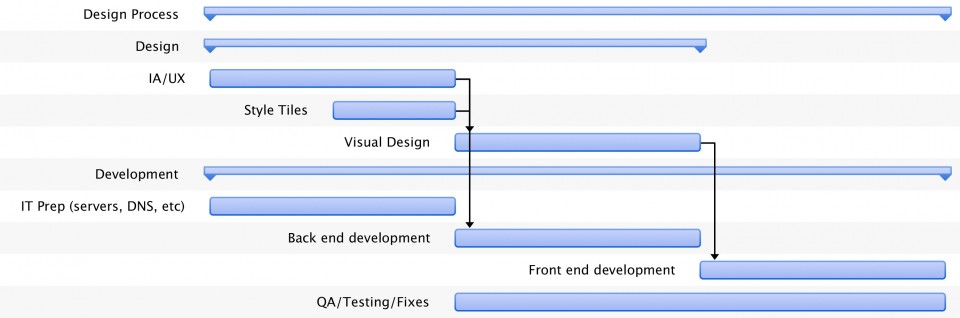
Agile Design Process
Agile. It’s not just for development any more. By applying the same agile principles we use in development to our design process, we’re able to design better websites faster and more affordably.
We do this by using style tiles to start defining a visual language, even while the IA/UX phase is still under way. This enables us to be more iterative with our design, to run more parts of the project in parallel, and to design final site elements only as needed, instead of trying to design an entire site in Photoshop before we start any development.
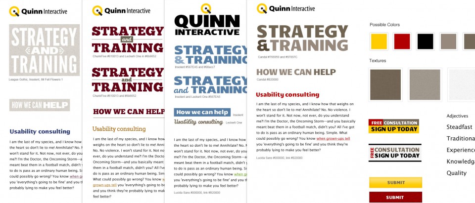
Style Tiles
Style Tiles are quick, iterative designs, typically highlighting design choices about fonts, colors, and interface elements that communicate the essence of a visual brand for the web.
Unlike full design comps, based on real content and information architecture, these designs allow us to concentrate on the brand and feel of the design, without getting bogged down in the details of content and functionality.
Although this sounds counterintuitive, it lets us get to a better aesthetic, much quicker than traditional design comps.
Once a common visual language has been chosen, we can then move on to applying it to real content.
You can learn more about Style Tiles from their creator, Samantha Warren, at http://styletil.es.
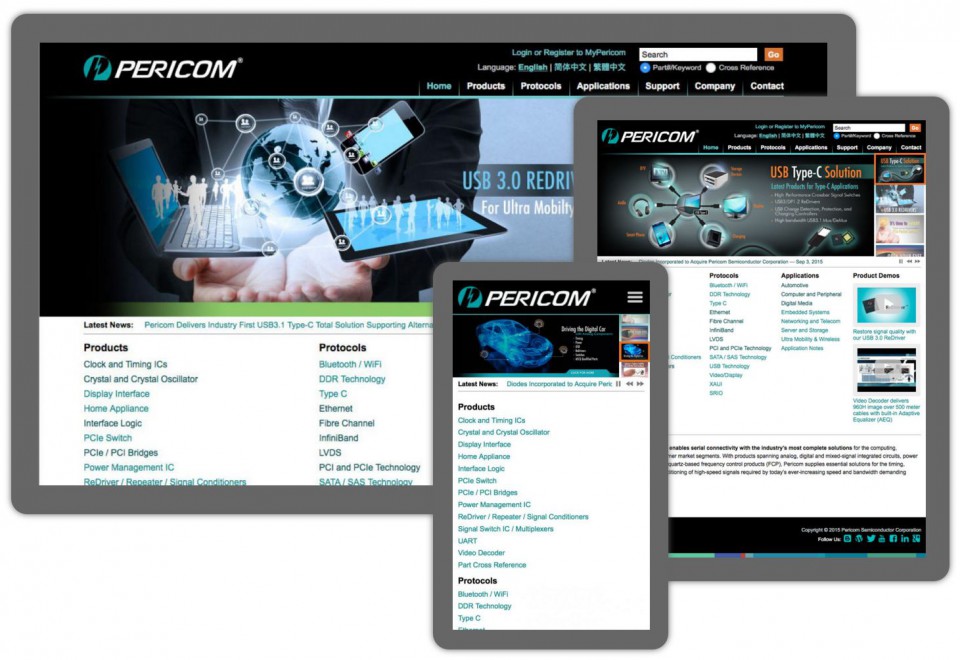
Responsive Design
People are using more and more diverse tools for browsing the web. In addition to desktop and laptop computers, these now include a variety of phones, netbooks, and tablets. Instead of maintaining a separate, complex, and expensive mobile app or website, a cost-effective way to handle these different devices is to make sites device-neutral, through responsive design principles and technologies.
The best way to ensure a seamless and effective user experience for the widest possible array of devices is to take a mobile-first approach to UX, IA, and design. This means designing for small, mobile devices first, and then using progressive enhancement to incrementally take advantage of bigger and bigger viewports. This way mobile visitors are always first-class users of your site.